The Most Complete Comicography of Richard Corben

Dark Horse is reprinting masterpieces!


Dark Horse Comics will release new editions of Richard Corben’s Murky World and Den in hardcover deluxe format starting from 2023.
- Last Voyage of Sindbad. Dark Horse. May 26, 2026. FC, 112 pgs; HC; 8″ x 11″. $34.99.
- Rat God. Dark Horse. Nov. 18, 2025. FC, 144 pgs; HC; 8″ x 11″. $39.99.
- Rowlf and the Other Fantasy Stories. Dark Horse. August 05, 2025. FC, 128 pgs; HC; 8″ x 11″. $39.99.
- Dimwood. Dark Horse. June 10, 2025. FC, 136 pgs; HC; 8″ x 11″. $34.99.
- Den 5. The Prince of Memories. Dark Horse. January 29, 2025. FC, 120 pgs. HC. 8″ x 11″. $39.99.
- Den 4. Dreams and Alarums. Dark Horse. October 23, 2024. FC, 192 pgs. HC. 8″ x 11″. $34.99.
- Den 3. Children of Fire. Dark Horse. September 11, 2024. FC, 136 pgs. HC. 8″ x 11″. $34.99.
- Den II. Muvovum. Dark Horse. July 31, 2024. FC, 128 pgs. HC. 8″ x 11″. $34.99.
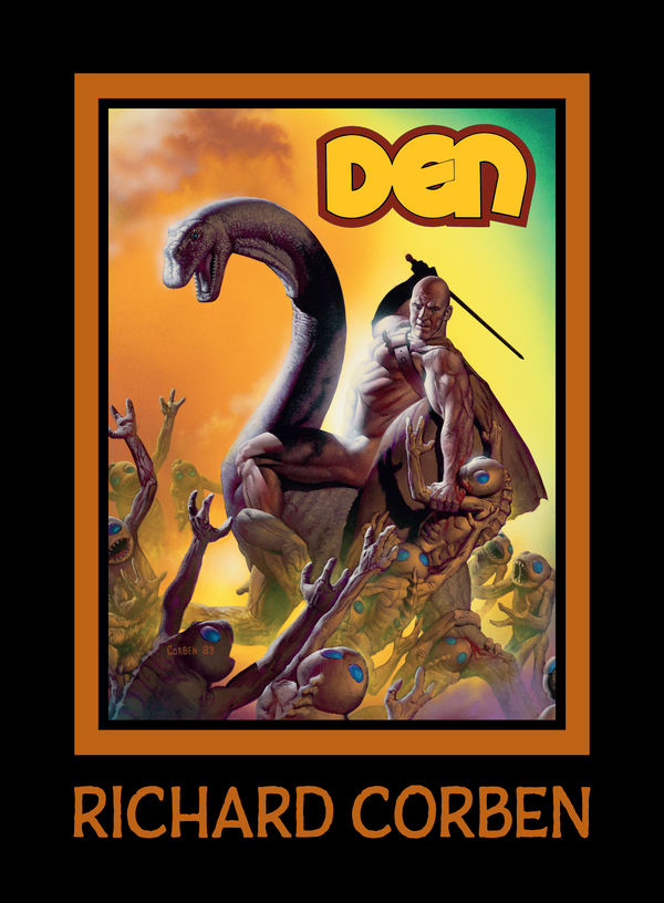
- Den [I]. Neverwhere. Dark Horse. August 30, 2023. FC, 128 pgs. HC. 8″ x 11″. $34.99.
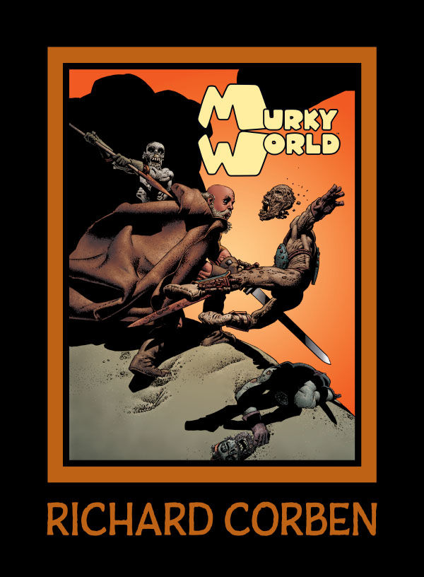
- Murky World. Dark Horse. May 03, 2023. FC, 156 pgs. HC. 8″ x 11″. $39.99.
- Reviews:
- RICHARD CORBEN LIBRARY | Dark Horse Comics | Heavy Metal Magazine | Underground Comix by Taylor Talks Comics! (Oct. 21, 2025)
- Rowlf and Other Fantasy Stories by Richard Corben by Hot Comics Tv (Sept. 28, 2025)
- BRAND NEW RICHARD CORBEN! PLUS SOME OF MY FAVORITE CORBEN STORIES AND ART! by Rave Sensation (Sept. 14, 2025)
- Den Vol. 1 | Overview/Review | Richard Corben Library | Dark Horse Comics by Back Corner Comics (Aug. 20, 2025)
- You Have To See Richard Corben’s Last Comic, Dimwood It’s Unbelievable! by Rowley Zero (July 14, 2025)
- Decades later, it is mine. Richard Corben’s DEN by Obscurities in Miniature (Sept. 15, 2023)
- DEN, Richard Corben’s Masterpiece is Back in Print! Geof Darrow Guest Hosts! (Aug. 26, 2023)
- Murky World Hardcover | Richard Corben’s Final Masterpiece | by Near Mint Condition (April 7, 2023)
- In Memoriam, Richard Corben (1940-2020)
Thanks for donators! You help to keep this site online. In Feb. 11, 2011 / March 3, 2018 / April 27, 2020 I updated my server package to have more space and higher traffic capacity.
Kickstarter: To Meet the Faces You Meet
A feature-length film based on the comic by Richard Corben and Jan Strnad, featuring the voice of Patton Oswalt.
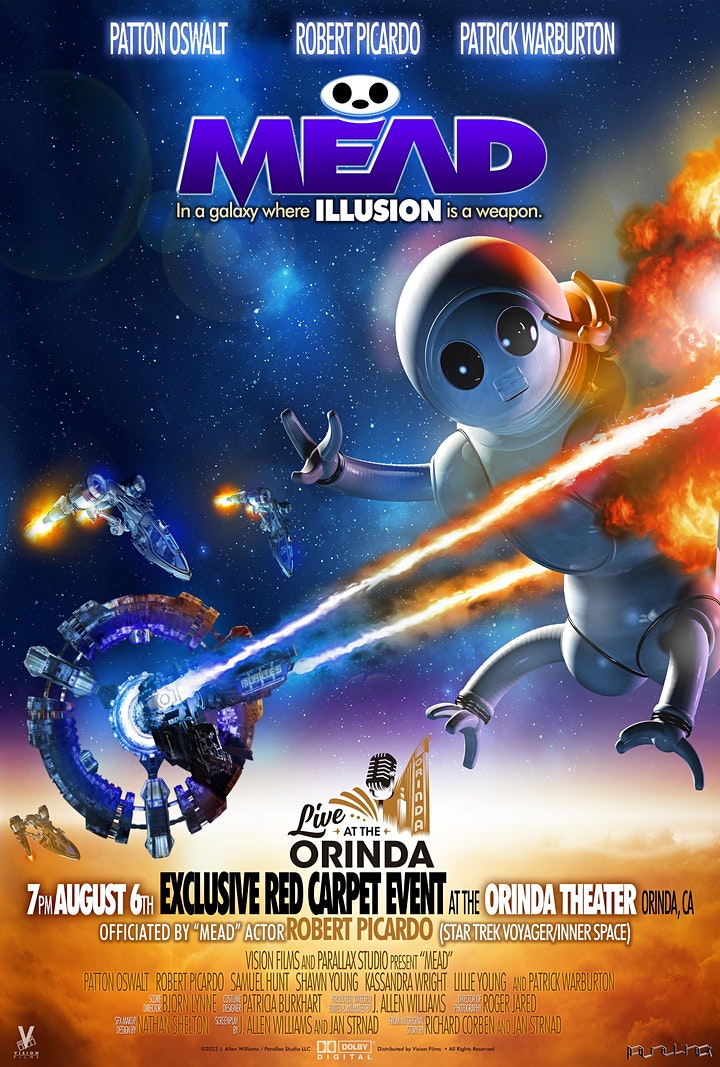

- Launching date: May 8, 2020, and it was planned to be over in June 7, 2020. Because of covid-19 the live action filming started was postponed to Autumn 2021. The ultimate launching date was Aug. 9, 2022 under a new title MEAD.
- Read more Kickstarter: Kickstarter: To Meet the Faces You Meet | To Meet the Faces You Meet aka MEAD (animated film)
Angoulême videos 2019

Upcoming!


- Picturum, The Art of Richard Corben
- The Best of Fantagor
- The Awakening and Other Science Fiction stories (collecting Slow Death Comics stories)
Unpublished!
- “Bloodsport” is a 9 page story of unknown origin. Mr. Corben sold his original art plates of the story on his site in an auction June 24, 2014. Unpublished.
- “Sins of Father” (11 pgs). Story by Bruce Jones. Unpublished.
- Tales of Mystery and Imagination is also a book not out on a market but according the interview with Scott Allie, that book will prob. never do. Unpublished.
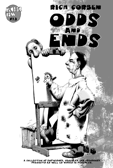
Out of Stock: Odds and Ends (2009). 32 pgs. 7″x10.5″. Incl. in B&W the second chapter of “From the Pit”, book and CD covers and more.
Awards!
- 2018: Angouleme Grand Prix Winner!
- 2009: Spectrum Grand Master: Winner!
- Other: Awards
Corben Studios Inc Facebook:

MuutaNet Facebook

The official Richard Corben web site:
corbenstudios.com
Richard Corben Fan Group Facebook:

Recent prints:
2026
- Last Voyage of Sindbad [DH] (May 26, 2026). Dark Horse / Fantagor Press. Hard bound. Color.
2025
- Rat God [DH] (Nov. 18, 2025). Dark Horse / Fantagor Press. Hard bound. Color.
- Rowlf and the Other Fantasy Stories [DH] (August 05, 2025). Dark Horse / Fantagor Press. Hard Bound. B&W.
- Dimwood (June 10, 2025). Dark Horse / Fantagor Press. Hard Bound. Color.
- Den 5. The Prince of Memories [DH] (January 29, 2025). Dark Horse / Fantagor Press. Hard Bound.
2024
- Den 4. Dreams and Alarums [DH] (October 23, 2024). Dark Horse / Fantagor Press. Hard Bound.
- Den 3. Children of Fire [DH] (September 11, 2024). Dark Horse / Fantagor Press. Hard Bound.
- Den II. Muvovum [DH] (July 31, 2024). Dark Horse / Fantagor Press. Hard Bound.
- Hellboy Artists Collection: Richard Corben (May 22, 2024). Dark Horse. Hard Bound.
2023
- Den. Volume 1: Neverwhere [DH] (Aug. 8, 2023). Dark Horse / Fantagor Press. Hard Bound.
- Murky World [DH] (May 3, 2023). Dark Horse / Fantagor Press. Incl. both “Murky World [II]!” (color), and “Murky World” (B&W). Hard Bound.
2022
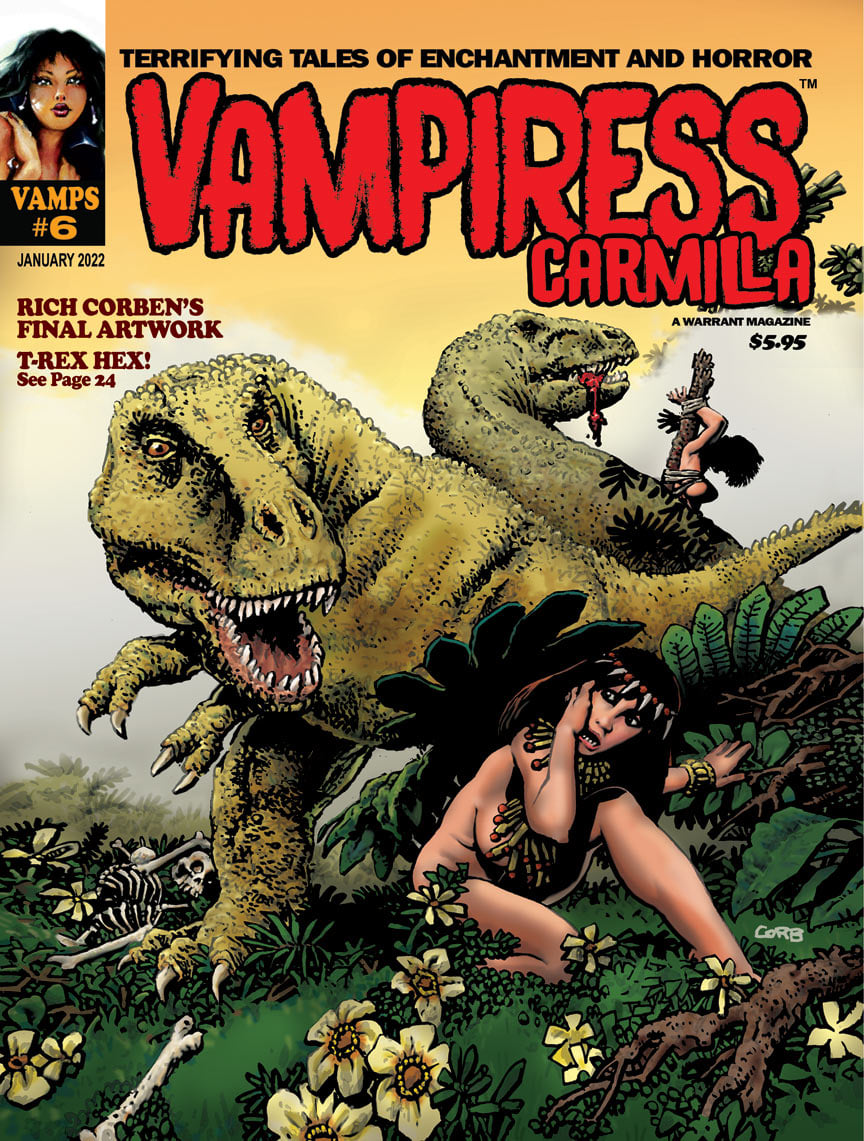
- Vamps #6: Vampiress Carmilla (Jan. 2022). A Warrant Magazine. Cover. Unpublished.
2021
- Slow Death Zero: The Comix Anthology of Ecological Horror (2021). Incl. “Garbage Man”. 8 pgs. Story by Bruce Jones. Last Gasp.
2020
- Heavy Metal #301 (Nov. 2020). “Murky World [II]!”, part 15(15), and Richard Corben Interview.
- Heavy Metal #300 (Aug. 2020). “Murky World [II]!”, part 14(15)
- Heavy Metal #299 (June 2020). “Murky World [II]!”, part 13(15)
- To Meet the Faces You Meet (May 2020), An Exclusive Kickstarter Special Movie Edition.
- Heavy Metal #298 (2020). “Murky World [II]!”, part 12(15)
- Heavy Metal #297 (Jan. 2020). “Murky World [II]!”, part 11(15)
2019
- Heavy Metal #296 (2019). “Murky World [II]!”, part 10(15)
- Mutant World and Son of Mutant World (Dec. 2019). Kickstarter funding. Deluxe Hard Bound with a addition of an exclusive art print tipped, numbered, and signed by Richard Corben, Jan Strnad, and Beth Corben Reed with print run of 200. Also print without deluxe. Anomaly Publications. Richard Corben, Jan Strnad, and Son of Mutant World colored by Beth Corben Reed.
- Creeps #20 (Oct. 2019). Cover art.
- Heavy Metal #295 (Oct. 2019). “Murky World [II]!”, part 9(15).
- Spirits of the Dead (August 20, 2019). Dark Horse. 2nd Edition. With the brand-new story: “The Man of the Crowd”. [outside link]
- Heavy Metal #294 (Aug. 2019). “Murky World [II]!”, part 8(15).
- Heavy Metal #293 (May/June 2019). “Murky World [II]!”, parts 6(15) and 7(15).

Angoulême 2019 Corben Books: Corben donner corps a l’imaginaire (Jan. 2019)
2018
- Heavy Metal #292 (Dec. 2018). “Murky World [II]!”, part 5(15).
- Heavy Metal #291 (Sept. 2018). “Murky World [II]!”, part 4(15).
- Heavy Metal #290 (June 2018). “Murky World [II]!”, part 3(15).
- Creeps #13 (Spring 2018). Cover art.
- Shadows on the Grave [HD] (Jan. 30, 2018)
2017
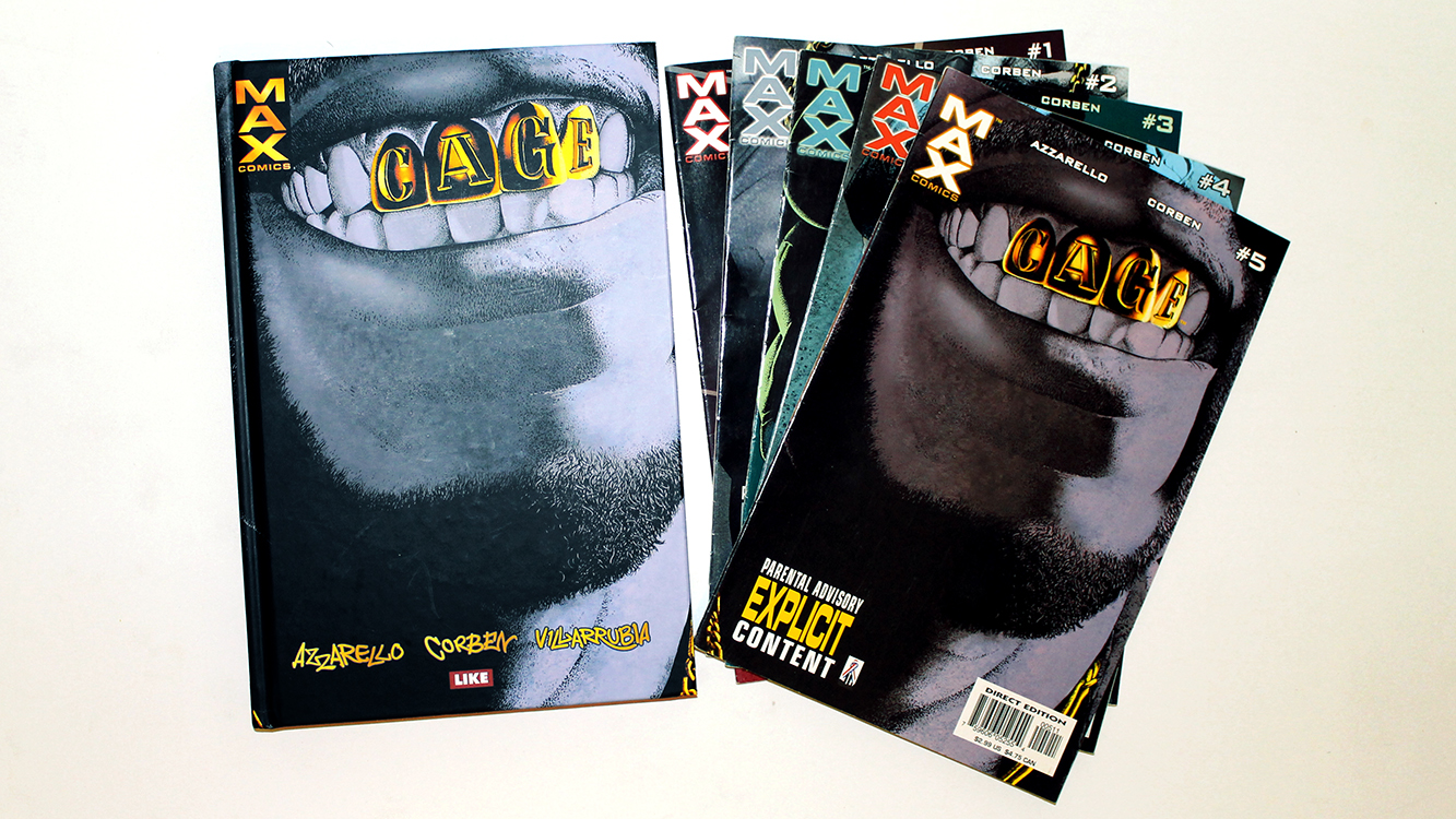
Available from Like [FIN]: Cage [FIN] (2017). Reprints of Max Comics: Cage #1 to #5 (2002). • Review: Cage [FIN] (2017).
- Heavy Metal #289 (Dec. 2017). “Murky World [II]!”, part 2(15).
- W.B. Dubay’s The Rook Archives Vol 3 HD (Nov. 1, 2017). Front Cover: Richard Corben.
- Heavy Metal #288 (Oct. 2017). “Murky World [II]!”, part 1(15). Till year 2020.
- Shadows on the Grave #8 (Sept. 13, 2017). Final issue. Story/Art/Covers: Richard Corben.
- Shadows on the Grave #7 (Aug. 09, 2017)
- Shadows on the Grave #6 (July 12, 2017)
- Shadows on the Grave #5 (June 14, 2017)
- Shadows on the Grave #4 (May 10, 2017)
- The Creeps #10 (April 2017). “Fair Trade” by Richard Corben.
- Shadows on the Grave #3 (March 8, 2017)
- Shadows on the Grave #2 (Jan. 11, 2017)
2016
- Shadows on the Grave #1 (Dec. 14, 2016). Story/Art/Covers: Richard Corben. 8 issues long!
- Rumble #13 (Aug. 17, 2016). Image Comics. John Arcudi, James Harren. B cover by Richard Corben and Reed.
- The Creeps #7 (July 27, 2016). “The Frankenstein Monster”.
- Creepy Comics #24 (June 22, 2016). B&W. 40 pgs. $3.99. Story: Dan Braun. Art: Richard Corben. Last issue!
- Serenity: Firefly Class of 03-K64, Free Comic Book Day 2016 (May 7, 2016) Mike Mignola, Richard Corben. A short story.
2015
- Corben Index, Book 3: Das Den-Universum (The Den Universe, Dec. 14, 2015). Incl. artiles about the Den Universe.
- Rat God [HB] (Oct. 14, 2015. Dark Horse).
- Rat God #5 (June 3, 2015. Dark Horse).
- Rat God #4 (May 6, 2015. Dark Horse).
- Rat God #3 (April 1, 2015. Dark Horse).
- Rat God #2 (March 4, 2015. Dark Horse).
- Rat God #1 (Feb. 4, 2015. Dark Horse). Richard Corben (story/art). Richard Corben, Beth Corben Reed (color). Color. [Read Interview]
2014
- CorbencomicartCom (Dec. 3, 2014) The NEW official Richard Corben web site.
- Buffy the Vampire Slayer Season 10 #8 (Oct. 22, 2014). Christos Gage(story), Rebekah Isaacs (art), Richard Corben (art for a three page flashback).
- Edgar Allan Poe’s Spirits of the Dead (Oct. 14, 2014).HardBound. Cover plus all stories by Richard Corben.
- Dark Horse Horror Sampler (Aug. 18, 2014). A free sampler magazine, also a digital version. 124 pgs. Color.
- Searchers after Horror: New Tales of the Weird and Fantastic (June 2014). Edited by S.T. Joshi. Cover by Richard Corben.
- Edgar Allan Poe’s Morella and the Murders in the Rue Morgue (June 11, 2014). Cover and both stories by Richard Corben.
- Corben Index, Book 2: Die grossen Epen (The Great Epics, April 22, 2014) incl. the full feature stories with comments.
- Jelovnik #3: Leglo strave (April 22, 2014, Serbia). Reprints Haunt of horror: Lovecraft 1-3 (2008). B&W.
- Edgar Allan Poe’s The Premature Burial (April 2, 2014). Cover and all stories.
- B.P.R.D. Hell on Earth #116 (Feb. 19, 2014). Variant cover.
2013
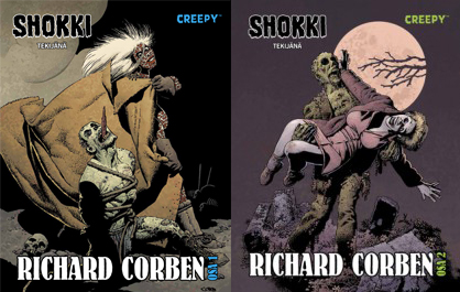
Available from Egmont-kustannus [FIN]: Shokki [II] tekijänä Richard Corben #1 (Sept. 2013) and #2 (March 2014). Reprints of Creepy Presents Richard Corben (2012). • Reviews: volume 1 and volume 2!
- CFA-APA #91 (Dec. 2013): The Art of Richard Corben. All covers by Corben.
- Edgar Allan Poe’s The Raven and the Red Death (one-shot) (October 30, 2013). Cover and all stories.
- Dark Horse Presents #29 (Oct. 23, 2013). “Alone” by Edgar Allan Poe adaptation.
- The CBLDF Liberty Annual 2013 (Oct. 2, 2013). Image. 48 pgs. Richard Corben tells a metafictional story about a cartoonist bringing back a well endowed hero, not too dissimilar to Corben’s own famous creation, Den. “Dun’s Return”.
- Dark Horse Presents #28 (Sept. 25, 2013).“The Assignation” by Edgar Allan Poe. 8 pgs.
- Corben Index, Book 1: Short Story Index (June 2013) by Sebastian F. Otten. Lists all German translated Corben (short) stories with comments. Exclusive interview with Richard Corben. €29,00. 108 pgs. In German language only!
- Edgar Allan Poe’s The Fall of the House of Usher #2 of 2 (June 19, 2013). A sequel and the cover art.
- Edgar Allan Poe’s The Fall of the House of Usher #1 of 2 (May 15, 2013). A story and the cover art.
- Creepy Comics #12 (May 08, 2013). A story and the cover art.
2012
- Edgar Allan Poe’s Conqueror Worm (one-shot, Nov. 21, 2012) by Dark Horse. Richard Corben. 32 pgs. Color.
- Dark Horse Presents [vol. 3] #18 (November 21, 2012) by Dark Horse. Richard Corben adapt. Edgar Allan Poe. “Shadow [II]” (8 pgs).
- Dark Horse Presents [vol. 3] #17 (October 24, 2012) by Dark Horse. Richard Corben adapt. Edgar Allan Poe. “Sleeper [II]” (8 pgs).
- Creepy Comics #10 (October 3, 2012). With John Arcudi.
- Dark Horse Presents [vol. 3] #16 (Sept. 19, 2012) by Dark Horse. Richard Corben adapt. Edgar Allan Poe. “Berenice [II]” (8 pgs).
- Creepy Presents Richard Corben (July 18, 2012) by Dark Horse. 320 pgs. All Creepy/Eerie stories. Plus a new cover art. HC.
- Creepy Comics #9 (July 11, 2012). B&W classic, “In Deep”.
- Ragemoor #4 (June 20, 2012) by Dark Horse.
- Vampirella Archieves #5 (June 2012) by Dynamite. Reprints restored “As Though They Were Living!”, “The Woodlik Inheritance!”, “Top to Bottom”, and some of color works by Richard Corben.
- Ragemoor #3 (May 23, 2012) by Dark Horse.
- Creepy Comics #8 (April 24, 2012). With Jeff Parker, Doug Moench, Rick Geary, Colleen Coover, Kelly Jones, and Richard Corben. Cover by Richard Corben.
- Ragemoor #2 (April 18, 2012) by Dark Horse.
- Ragemoor #1 (March 21, 2012) by Dark Horse. A continous story.
- Dark Horse Presents [vol. 3] #9 (Feb. 22, 2012) by Dark Horse. A color Edgar Allan Poe story, “The City in the Sea” (8 pgs).
- Murky World #1 (Feb. 8, 2012) by Dark Horse. B&W. One shot.
- Men of War: “Last Measure” (Feb. 1, 2012) by DC. Story by John Arcudi (8 pgs).
- Creepy Archives Volume #12 (Jan. 25, 2012). “Lycanklutz” by Richard Corben, restored with piety by José Villarrubia.
2011
- Hellboy: House of the Living Dead (Nov. 2011) by Dark Horse. One-shot.
- Famous Monsters of Filmland #257 (Aug. 24, 2011) by IDW. Cover.
- Dark Horse Presents [vol. 3] #3 (Aug. 24, 2011) by Dark Horse. B&W own story, “Murky World”, Part 3.
- Dark Horse Presents [vol. 3] #2 (June 22, 2011) by Dark Horse. B&W own story, “Murky World”, Part 2.
- Hellboy: Being Human (May 2011) by Dark Horse. One-shot.
- Dark Horse Presents [vol. 3] #1 (April 20, 2011) by Dark Horse. B&W own story, “Murky World”, Part 1.
2010
- Hellboy: Double Feature Of Evil (Nov. 17, 2010) by Dark Horse. One-shot. Two short stories in one, a real double feature.
- The Spirit: Moon Wolf (Oct. 20, 2010) by DC. Creator: Will Eisner. Story: Jan Strand. 8 pgs. B&W.
- Famous Monsters of Filmland #251 (July, 2010) by IDW. Cover.
- Buzzard #1 (June 9, 2010) by Dark Horse.
- Hellboy in Mexico (Or, a Drunken Blur) (May 5, 2010) aka Hellboy: Camazotz by Dark Horse.
- Cavewoman Alternative Cover (Aprils Fool 2010) by Image Comics/Frank Cho.
2009
- Hellboy: The Bride of Hell (Dec. 23, 2009) by Dark Horse.
- Odds and Ends (2009) by Fantagor Press.
- Starr the Slyer #1 (Sept. 2, 2009), #2 (Oct. 7), #3 (Nov. 3), #4 (Dec. 2) by MAX. Written by Daniel Way; Art/Cover by Richard Corben; Color by José Villarrubia.
- House of Mystery #16 (Aug. 5, 2009) by Vertigo. Written by Matthew Sturges and Bill Willingham; Art by Luca Rossi and Richard Corben (10 pager, Hellblazer); Cover by Esao Andrews.
- Conan 7: Cimmeria (TB: May 20, 2009; HB: May 27, 2009) by Dark Horse.
- Conan the Cimmerian #1 (July 16, 2008) , #2 (Aug. 13), #3 (Sept. 17), #4 (Oct. 15), #5 (Nov. 19), #6 (Dec. 17) and #7 (Jan. 21, 2009) by Dark Horse.
2008
- Ghost Rider #30: Villain Variant [Cover!] (Dec. 17, 2008) by Marvel.
- Cable #7: Zombie Variant [Cover!] (Oct. 1, 2008) by Marvel. Pay attention, colors by José Villarrubia (wrong info on Marvel web site!).
- Unknown Soldier #1 [Variant Cover!] (Oct. 22, 2008) by DC Vertigo. Colors by José Villarrubia.
- Hellboy: The Crooked Man #1 (July 2), #2 (Aug. 13) and #3 (Sept. 24) by Dark Horse. Story by Mike Mignola. Art/Cover by Richard Corben.
- Haunt of Horror: Lovecraft #1 (June 4), #2 (July 30) and #3 (Aug. 27, 2008) All by Richard Corben.
- Jonah Hex” by DC (#31, May 7, 2008) Cover Art
- Living with the Dead (Cover Art) by Dark Horse (#1: Oct, #2: Nov., #3: Dec., 2007, TB: Feb., 2008)
2007
- Harlan Ellison’s Dream Corridor Vol. 2 (2007). Includes a rare 1990 never before published14 pg story “The Man on the Juice Wagon”, based on Harlan Ellison story under the same name.
- Ghost Rider #6 (Dec. 2006) and Ghost Rider #7 (Jan. 2007) story by Daniel Way, art by Richard Corben, colors by Jose Villarrubia
2006
- American Slpendor #2 (Oct. 2006) story by Harvey Pekar, art by Richard Corben
- Haunt of Horror: Edgar Allan Poe #1 (May 2006), #2 (June 2006), #3 (July 2006) All by Richard Corben
- Hellboy #25 (Feb. 2006) and Hellboy #26 (March 2006) story by Mike Mignola, art by Richard Coben
- Aliens/Predator Panel to Panel [TP] (June 2006) Inc. various, among others Richard Corben.
2005
- The Fantastic Worlds Of Clark Ashton Smith (2005) Edited by James Van Hise.
- Toe Tags (DC 2004/2005). Story by George Romero. Art OUGHT TO BE by Richard Corben, but was instead by Tommy Castillo and Rodney Ramos. Covers by Berni Wrightson.
- The rest: Periods
The Offical web site of Richard Corben: www.corbencomicart.com The Official Corben Studios site was founded in Nov. 10, 1998. Mine was already up in the air (prob. starting from Aug. 27, 1997).
Copyright © 1997 Heart-Attack-Series, Ink!
Created: August 27, 1997. Last updated: April 1, 2026 at 21:11 pm
